On 13 September 2011 Microsoft released Windows 8 Developer Preview version. You can install it and have a play yourself. Read this article to find out how.
Be aware that this release is very early pre-beta version which is not really intended to be used by general public. A lot of things inside Windows 8 may be changed, added or removed. Nevertheless this release gives you some ideas of which way Microsoft Windows is heading. 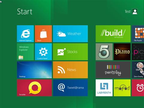
It’s pretty obvious that new Microsoft OS is very much about touchscreen devices. Obviously Microsoft can see success of Apple iPad and wants a peace of increasing tablet market.
For the first time Windows 8 will run on low powered ARM devices.
Microsoft are saying there will be only one version of Windows 8 which will run on all devices including tablets, notebooks and desktop PCs. Interesting to see whether this actually works for them. We have some doubts about this approach. They already announced that ARM version will not run old x86 software, at least not without without recompiling.
Hardware requirements
Microsoft haven’t really increased hardware requirements since Windows Vista, so once again you can upgrade OS without upgrading your hardware. On the other hand most people get their Windows OS upgrade only when they buy a new machine. Also, although Windows 8 can happily work with old fashion keyboard and mouse, to get the best experience you will need a touchscreen device.
- 1 GHz or faster 32-bit (x86) or 64-bit (x64) processor
- 1 GB RAM (32-bit) or 2 GB RAM (64-bit)
- 16 GB available hard disk space (32-bit) or 20 GB (64-bit)
- DirectX 9 graphics device with WDDM 1.0 or higher driver
- Taking advantage of touch input requires a screen that supports multi-touch
New Metro interface
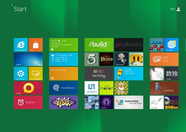
Microsoft says Windows Metro interface will be the main Windows home for all devices including tablets, laptops and desktops. Most people have mixed feelings about this. It works really well on touchscreen devices, however on a large desktop PC monitor massive tiles looks a bit out of place. Navigating with mouse and keyboard is possible, but again, it just doesn’t feel quite right.
As far as tablets and other touchscreen devices are concerned Microsoft Windows 8 Metro looks really promising.
Multitasking and split screen
Windows 8 Metro offers much more advanced multitasking than iOS or Android. You can not only have multiple apps running in a background, but can split the screen and have your stocks app opened right next to a game you are playing.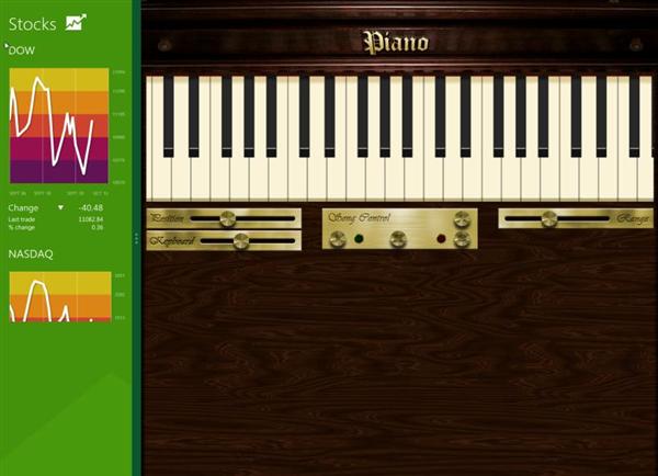
Live Tiles
Large interactive tiles provide lots of useful information without even opening apps – much more useful than static Android and iOS icons. You can see weather information without even opening weather app, calendar tile shows your forthcoming appointments and so on. Obviously third software developers will make a good use of this great feature.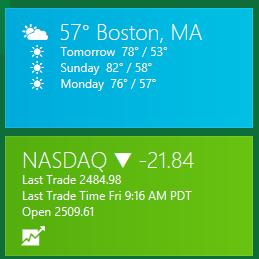
Cloud Sync
We haven’t seen this in a real world, but Microsoft promises to sync your apps and data across different devices over a cloud. App sync will only work with new metro apps though.
Running Windows Desktop apps on tablets?
Another potential benefit is that should you need more power from your Windows 8 tablet you can launch Windows Desktop and do everything you normally do with your desktop PC. You can even have your screen split between Metro and desktop apps. One catch here is that old x86 software will not run on ARM devices, at least not without recompiling the code. It would be interesting to see how this affects batter live and performance of ARM devices. Some argue, that it would make more sense to remove old desktop code from ARM version completely and leave Metro.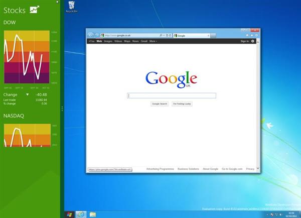
Will it succeed?
There are number of unanswered important questions, such as performance on low powered tablet hardware or power efficiency. Microsoft ability to persuade developers to quickly create large number to hight quality Metro apps is immensely important as well. If Microsoft get these things right, Windows 8 tablets have huge potential and will definitely give Apple iOS devices a run for their money.
Regarding Metro on desktop and laptop devices I am much more dubious. Microsoft may well improve Metro experience on desktops, but I have no doubt that there will be a massive resistance if Microsoft tries to move all its Windows users to Metro. And what about business users? I just don’t see large businesses letting Metro interface anywhere near their users. Maybe Microsoft will allow disabling all Metro features via group policy; maybe there will be different Windows 8 Business version; or maybe Windows 7 will remain OS of choice for businesses? Will have to wait to see…
Old style Desktop
Windows Metro interface is your default home and stating point in Windows 8, however old good Windows Desktop is still available. On the first look it looks almost exactly the same as Windows 7 desktop. To get there you have to click on a Desktop app in the Metro home screen. At the moment you can’t make Windows go automatically into the desktop on startup. On top of that, clicking the Start button, simply throws you back into Metro home screen! 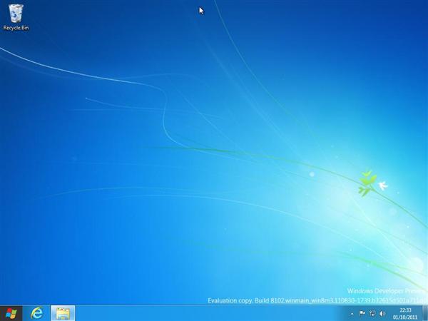
To launch an old type Windows software from within Desktop interface you must either have a shortcut on the Desktop or program must be pinned to the taskbar. Otherwise you have to use Metro search function. Click on a Start button (to launch Metro interface) and start typing. Once your program appears in the search results click on it and your will be sent back to the desktop where your application is now launching. It’s all pretty quick in practice, but it feels weird jumping from one interface to another just to launch a desktop app.
Microsoft will obviously have a huge pressure from its massive desktop user base to return Start Menu and allow Windows Desktop to be the default interface. If they are planning to resit this, much better Metro and Desktop integration is needed.
So, what’s new in Windows 8 desktop so far?
Improved Task Manager.
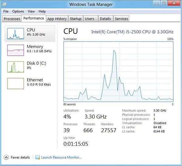
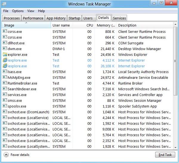
Task manager in Windows hasn’t changed for ages. Windows 8 introduces improved task manager and it looks really good. There is a basic version which displays running and suspended apps and allows to close them.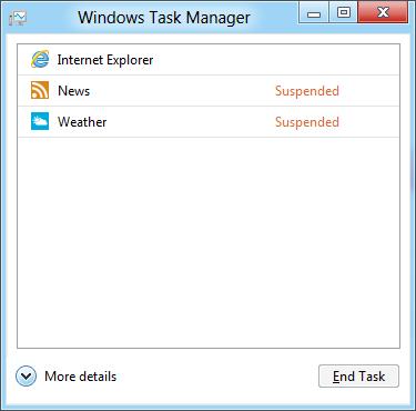
But click on the More details button and a completely new beast is revealed. It shows you tons of useful information about the system which wasn’t available before. Pros and power user will really like this.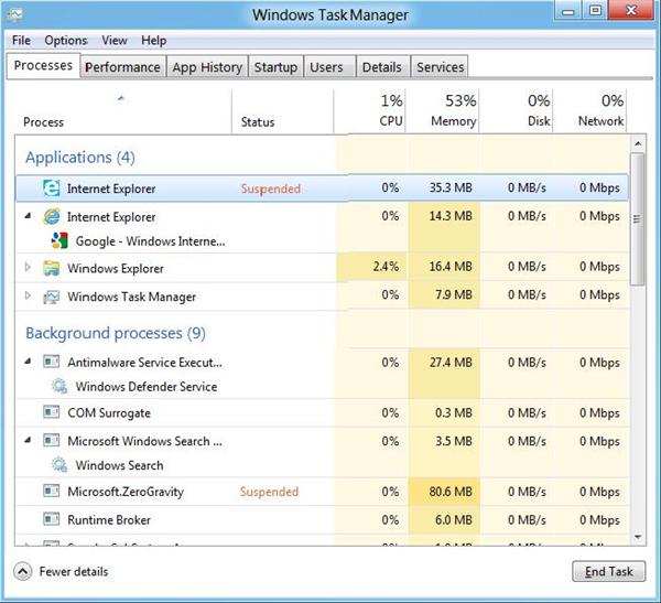
Windows Explorer
Windows Explorer received a MS Office style ribbon which now is pretty standard in Windows. You can see why Microsoft did this – it’s definitely more touch friendly and is still fine to use with keyboard and mouse.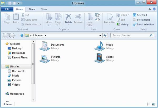
More to follow…

Leave a Reply